Saturday, April 30, 2011

a reading space, a writer's place... st. mary's house final project

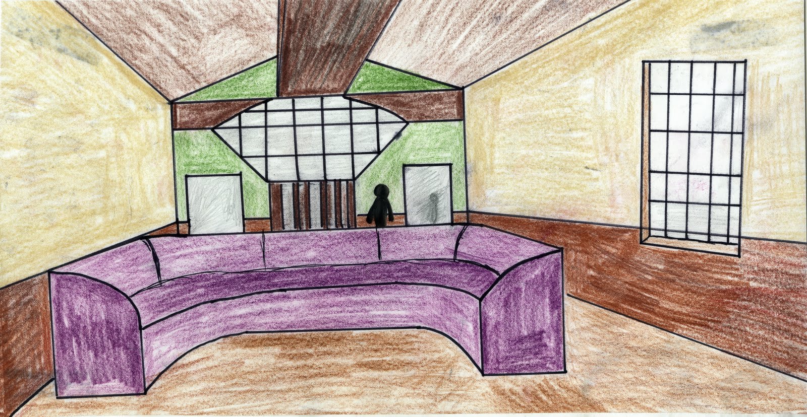
Persepective of Public Library Room

Section A

Section B
Plan

 
Color and material idea palate plan


Perspective of Writer's bedroom and of Reading Room


A reading space… a writer’s place
MFA Creative Writing Space in the former St. Mary’s House

“Written and illustrated by cory odell”
The MFA Program for Creative Writing at UNCG has chosen to expand their possibilities and create a space that both serves the students of the program and a living space for visiting writers to live while they are staying at UNCG.

The campus has chosen to remodel the former St. Mary’s House to accommodate these needs.

The newly created space offers living quarters for visiting writers and public spaces for meetings and public readings

Due to the rules of the historic college hill neighborhood, interior only was changed.

“The Inspiration”
When designing this facility, I drew a lot of inspiration from nature. Throughout time many people, not just writers have turned to the natural world for inspiration. You can find many elements of this. Different woods were used throughout to add different colors and textures to rooms.
Many of the wall colors were of earth tones. Many greens, browns, and dark reds can be found throughout.
Stones and rock tiles used to add the elements of the natural occurrence found in nature.
A large circular patio is located out back for public usage so readings and writings can be done directly in the natural world.

“The Spaces”
Many of the rooms serve as multi-purpose rooms. The front room can be a study area and also a meeting area for students and faculty. A wall of screens can be opened up making the second room part of the first, allowing for large public readings to take place.
The third space found in the facility is a library that can be used for both studying and writing. All three of these spaces make up the public use spaces of the building.
In the back of the building are the private quarters for the resident writer.
A Kitchen/Sitting area, a living room that opens up slightly to the library serves as a living room. Located in the back of the house is a room for sleeping as well as an office for working.
There is 1½ bathrooms in the complex. One located off the library for the public and one located in the bedroom for the private quarters.
Behind the home is a space for the writer to park an automobile, a patio for both public and private use, and small gardens.


Friday, April 29, 2011

Blog Post 14: My Special Building, Space, Object, and Place

Building: St. Basil's Cathedral
I have never been to this place in person, but I have been in love with it since a small child. I love the shape and colors of the building. It has always made me think of ice cream. I remember first learning about this building when I was a kid and I was looking at photos of it in a national geographic that belonged to my grandfather. I thought it was some type of palace and I wanted to live in it and be the king of Russia.

Space: Lobby of Greensboro's Proximity Hotel
I think this is such a cool space... and it makes it even cooler that it is in our very own back yard. It feels very hip and modern and something that one would never expect in little old Greensboro, North Carolina. The entire hotel is "green" and it actually ranks up as one of the greenest hotels in the world... A pretty fine achievement if you ask me.

Object: iPhone 4
I have one of these. I have spent my life dealing with bad cell phones, over and over again. I have never felt that they options they offered fit for me, or they worked as well as they were suppose to, until I bought this phone. I cannot tell you how much this phone helps me in my daily life. I can check my email, use it for my homework, listen to my favorite music, watch movies or play games when I am bored, or keep in touch with all the people I know and love. I use to think people were lame when they said things like "I would be lost without my phone", but I know exactly what they mean know.

Place: Iceland
I would love to visit this place so bad. I have never seen a photo of the landscape that didn't take my breath away. It is such a clean nation that has such a unique way of life and such a special looking landscape. It is one of the youngest pieces of land on the planet and as we speak it is growing and changing. They call it the land of fire and ice... now that sounds like a pretty cool place to see.

Unit Summary 3

As we come to the modern ages, we have seen many styles of design come and go, show back up, come totally left field, and hit us with a bang, but never really catch on. All these things are what make modern design what it is today.

One of the biggest aspects I saw in this chapter is how modern designers used elements from the past and mixed it into a hodgepodge to make their designs work in the new age world.

Fallingwater House
First person who comes to mind for this is Frank Lloyd Wright and his homes that he designed.
Robie House

These house have a modern look, but they both have connections to traditional Asian designs that have been seen for hundreds of years already.

We also saw in Europe the Bauhaus school and how they felt to be modern things needed to be functional for design to properly work for people. Things needed to be simple, but they needed to fit for peoples everyday lives. Ludwig Mies van der Rohe for example spread his influence around the world with buildings that were now being known as high rises. They took inspiration from former design elements, but instead of building out, they began to build up, and I do mean up.
Lakeshore Apartments in Chicago

Interiors became much more important to the overall designs as well. People saw that if the exterior was the face that was shown to the world, the interior could add even more to the people who lived inside. They began to mix match styles of interior design and furniture and would bring in old styles and mix them with the new as well too.


Gamble House


We may think of this as what it is to be modern, but honestly it is all but modern. If it is anything it feels like what we know as the modern world of design is nothing more then calling on all things we have seen over the course of design itself. We have taken a collection of the old, made it fit to the new slick and clean idea of the new and what we have is modern design.

I find this a very fitting end to our time together in design history. It truly does feel like the world has come full circle, and as we look to the future we see even more changes of design as we move forward faster and faster into the ideals of what it takes to be design of the computer and technology age.
Cyber Egg Sturcture in India


Monday, April 18, 2011

Blog Post 13


Scandinavians have been very involved in the design world for many years. Ikea is just another example of their design concepts.

Ikea has been able to bring the world Scandinavian design, at a cheap and very affordable cost. They have made the items very easy and do it yourself which helps cut down on the price because less labor was put into the making of the product. It has also forced people to be more involved with their furniture, by allowing them to be part of the design and construction process of what they buy.

The items are very simple in design, and have a very clean and slick modern look and appeal to them.

Monday, April 11, 2011

Blog Post 12

When I think of something that is a "good design for all"  it would have to be wayfarers by ray-ban
They have a slick and timeless design. They have been around for years and have made their way into more popularity now then ever before. They can be found in many different styles, colors, shapes, and sizes. Weither you are an elvis man or a beatles man they can work for you.

They have a sturdy plastic frame that no matter how many knock-offs are made, they cannot stand up like these shades do.

Their style works with many different fashion styles, and are the accessory that works with just about any outfit.

I have two pairs personally, and I would not trade them for anything... Unless it was for a million dollars, then I would use that to buy more... a lot more.

Reading Response 12: Welcome to the Bauhaus

photos provided by www.wikipedia.org

Friday, April 8, 2011

Monticello and Fallingwater

 I greatly enjoyed my trip to see both Monticello, Thomas Jefferson's house and Fallingwater, one of Frank Lloyd Wright's most recognized designs in his entire career.

Both places were very unique homes with years and years of history to them. For me I loved Monticello for it's history and the important place that it holds in American history. I had some parts of me that felt very odd visiting this place though. I hate that it is portrayed very clean cut compared to it years ago. Let's not deny the fact that this was a plantation and many slaves lived out their servant style lives here, a fact that I felt was ignored quite a bit on the tour.
Design wise, Fallingwater was a favorite. I love this house, I made the joke a millions times on the tour, and I feel I must make it again. I will own this house someday. I did find it very odd at how low the ceilings were in many of the rooms. I am pretty tall, and I found it to be pretty cramped in several spots of the tour. The interior was amazing. There was a lot of Asian design influences, and I have always loved those.

I also loved the openness of the house and how the windows and balconies played such a huge part in the overall feel and ideals behind the house itself. It really did feel like a house that functioned just fine and was completely in tune with the natural surroundings near by, like the rocks, trees, and river.

This trip was so much fun, and before I die, I will see both of these locations again... And maybe even come up with enough money to buy Fallingwater after all.

both photos taken myself

Unit Summary Two

This has been a long unit this time around. Hundreds and Hundreds of years of design and architecture crammed into just a few weeks.

Notre Dame
When we last left off Rome had fallen, the dark ages had begun and people were turning to god more then ever. So much, that people were building huge structures or cathedrals to serve as their worship spaces. Their very construction mimicked all kinds of things that related to their holiness, and it pretty much became a standard in how to construct the buildings too. The buildings were shapes of the holy trinity and tall towers were constructed to look as if they are reaching up to the very heavens.

The dark ages were a period that didn't get it's name for no reason, things were pretty dark and chaotic. Order did not seem to exist, a place of worship was the only space people felt was comfortable and safe.

St. Peter's
Arts and Sciences progressed and we came into the period we all know and love called the "Renaissance". It is a resurgent of the arts and sciences from the previous Greek greats. This period lead to many changes in architecture. Those Gothic cathedrals that we talked about earlier have now changed. They seem to have become softer around the "religious symbolism" edges, and become more fluid and have much more context about the changes and time period at hand. It was also about the combination of eastern and western meeting to form new styles never before seen.

With these expansions it allowed for many newer ideas to be used and older ideas to be expanded upon. It was a new age of design where many old rules were been broken and tons more being created and used all over Europe and the world.

Versaille
Semiotics and new ideologies were everywhere and it seemed like everyone had their own. France was enjoying the ideals of building large short buildings with elaborate grounds to show the idea of one owning all of the landscape possible, like Versaille.

Italy was playing with these ideas too, of large country homes that expanded across the landscape.

In England the spread of the English ideals through colonialism and they had influences coming and going all over the world. This also applied to the United States, or the colonies at that time period. I am not going to bore one with what happened, but a war broke out and the colonies created their own country, America.

The America's had to start working on their own design ideas and techniques not only to rub it in England's face, but to also catch up with the great nations of Europe.

The ideas we began to use in our designs were based upon the ideas of Greeks and Romans. Columns to show importance and huge domes. This can easily be seen on our governmental buildings. Like the Capitol building.
The Capitol Building
A lot of the same elements can still be seen, but they have changed in ways. The way we build has changed too. Stone has given way to steel and cast iron, which allowed buildings to grow and change in ways never seen before.

Wrapping up the unit we are brought to the world fairs of the world. We use them to show off our progress as nations to the rest of the world. It allowed us to see and show other places our designs and the technologies we had created. We had come from the ages of darkness to everything we do being a new way of thought and vision. We came 1,000 of miles from where the millennium started, but our ideas had never been better, and they still have places to go.
1904 World Fair

Wednesday, April 6, 2011

Reading Respose 11: Frank Lloyd Wright's Home

To Be Modern (Blog Post 11)

The chase of always wanting to be modern helps create the image that one is more advanced than another.

America chased this greatly in the 20th century because they had something to prove. They were the baby nation of all the greats like France, Italy, England, and so on. We wanted to prove that even with less experience as a nation of like ideals and passions, we could keep up, or even surpass the greats. That is why we attacked so hard on staying modern.

One of the places I see this the most is in American airports.
Dallas Fort Worth (Terminal D) Exterior and Interior
 Airports would seem a very fitting place to show off ones great modern style. It is the gateway into your nation, the first thing people of other nations see. Why not hit them hard for the very start with our modern style of architecture and design.
 
 http://dfw.cbslocal.com/2010/12/03/dfw-terminal-d-partially-evacuated-over-bag/
http://hedonia.seantimberlake.com/hedonia/2007/06/cantina_laredo_.html