After a nice long break from school, I have been able to do some thinking about what I have learned so far and what I still wish to know.
Auto cad was not something I did well at. I still and not very familiar with that program and I still need as much work with it as possible. I barely can do simple functions on it, and not even completely done with the last assignment with the program.
I would still like to see how to do more things with photoshop. I am still not real certain how to do some of those effects to the photos. I would like to understand those more.
Honestly, a general over view or touch up on all the programs so far would be of great benefit to me. I could always use more and more work with these programs.

Tuesday, March 13, 2012

Sunday, January 29, 2012

Sunday, December 4, 2011

A Cabinet of Curiosity By Cory Odell 11/21/11
I have always felt that furniture should be functional, but not be stripped of any aesthetics at the same time. I feel if anything, pieces should be functional works of art. Many of my designs over the course of time here in the IARC program have been very conceptual pieces of art, maybe not with the most furniture functionality aspects. I felt that it was time to add more functionality, but still promote the same idea of artistic elements as well. This was a very heavy driving force in my concept for my cabinet of curiosity piece.
When first approaching the project I felt I needed to take all the objects being presented along with the piece, must be taken in consideration with the design. I wanted to draw a true connection between my design and what they were designing to go into the cabinet. I felt this was the only true way to make these pieces truly fit with my design.
When talking with Claire Druga, Shelley Gates, and Fallon Shearin I was able to grasp a better understanding of what they were designing in their studio. They were creating vessels for objects for other classmates. These vessels were then going to find a place to fit within our cabinet… a vessel for vessels if you will.
The first object is a box that contains a cat collar. Claire Druga designed this. It has pictures of another studio mates cat and a place to put the collar. The second is a tray for a teacup and tea. Shelley Gates designed this piece. Lastly we have Fallon Shearin’s object, a box for a hair-dryer that is done in Mendhi designs. These are the henna tattoos that are worn on the hands of Indian brides. After seeing all three pieces, I realized that there was an easy connection to be made. That connection was Victorian era design.
As I learned in Professor Mendoza’s class, the Victorian’s loved gadgets. They were right in the middle of the industrial revolution, and building and design objects to add simplicity to life was a huge trend. They created gadgets that had specific purpose. This made me think of Shelley’s tea tray that holds both the tea and the traveler’s mug.
Cats were also very big in interior design from this time period. That is also what drew my connection to Claire’s piece. It also connected well to the specific gadgets for specific uses theory as well.
Fallon’s Mendhi designed box made me think about “Orientalism” design. This was very popular during the Victorian era. It was pieces of furniture that were based upon Asian cultural pieces, but they lacked the cultural ties. They were mainly wanted for their exotic looks, but few people knew or understood the true purpose and the meaning of the designs.
All three of these objects lead me to my final design idea, basing the piece on an idea of Indian traditional cabinetry, but presented in an “Orientalism” design. These were what I felt best spoke to the inspiration and to the pieces themselves.
My materials were based off of many traditional elements of Indian design. I used Rosewood as a material, a species of lumber commonly found and used in India. I used Rattan on the doors; this is a style of design that was all the rage in Europe, when Britain imported it back from India during the Victorian era. I also used cast iron elements on the piece. There is also elephant style heads on the side to hold the doors open. Elephants are very popular in traditional Indian works of design and art.
The piece features three shelves, one, which is enclosed behind iron, bared doors. On the top shelf there is also to smaller spaces behind small doors. There are larger doors on the front of the piece that can be opened or closed and give the piece a more traditional armoire appearance.
I used a lot of colors that can be commonly found in Indian art and design, bright oranges, reds, purples, and turquoise. These colors can be found highlighting the three shelves within the piece.
The piece stands just shy of 3 ½ feet tall. I saw it as also being a functional piece in the sense it could also be used as a side table. That was my main goal in the overall design; I wanted it to have multiple purposes.
I also tried very hard to allow it to have various functional ways, yet still have varying looks. This is what brought me to add piano hinges on the front so they can be pulled completely to the side, and allow of all the shelves to show. It also allows the piece to have a lot more dimensions and colors when the piece is fully opened. The doors can be hooked to the sides on elephant head cast iron hooks that will keep the doors held open if one wishes, but the elephant heads also add another unique design element if one chose to keep the front doors of the cabinet closed.I thought is also very unique that my piece contained a cabinet within the cabinet. I used this concept based upon my first ideas of a vessel for vessel, a cabinet within a cabinet. I also thought this would be a fitting spot for the tea tray designed by Shelley. It played off the idea of cabinets for tea sets, something that was also very popular during the Victorian era.
I used a lot of historic elements to pull this piece together in its entirety. I looked a both traditional Indian cabinetry as well as the historic Victorian era. All of these elements, along with the pieces created by Shelley, Fallon, and Claire helped me to create my final design. I feel that it is a multi-functional piece, which has several different ways to allow it to take on one look or another. I feel that it could work in many different living spaces, and it is a piece that is simple, yet charismatic and enchanting, a true cabinet of curiosity.
Tuesday, November 8, 2011
A New Concept for the Yacht
a design for future sea living life was recently brought to my attention... and for any james bond movie buffs, a yacht like the villain lair in the spy who loved me.
 it is called utopia. and it is a living space on the sea.
"Utopia is not an object to travel in," said a spokesperson. "It is a place to be, an island established for anyone who has the vision to create such a place."
it is roughly the size of a modern day cruise liner, 100m x 100m
four helicopter pads
a swimming pool
observation deck

 this concept came from a james bond film called the spy who loved. the designers Yacht Island Design and BMT Nigel Gee say Atlantis, as it was called in the film, drew into their design greatly... design ideas really can come from anything.
Source: http://www.ybw.com/news/would-you-live-on-a-james-bond-villain-style-floating-island/529798

"Utopia is not an object to travel in," said a spokesperson. "It is a place to be, an island established for anyone who has the vision to create such a place."
it is roughly the size of a modern day cruise liner, 100m x 100m
four helicopter pads
a swimming pool
observation deck
 this concept came from a james bond film called the spy who loved. the designers Yacht Island Design and BMT Nigel Gee say Atlantis, as it was called in the film, drew into their design greatly... design ideas really can come from anything.
Source: http://www.ybw.com/news/would-you-live-on-a-james-bond-villain-style-floating-island/529798
Friday, October 28, 2011
Blog Post 005: Lights
Lighting was something the WAM group has bounced back and forth on. At first we felt like putting lighting within the piece, but due to budget and lighting limitation we chose not to go that route
Making the piece run off interior light had two options, battery lights, that would need to be changed or recharged, and connecting it to the wall. We didn't care for the latter idea either. It would limit where our piece could go, and we wanted this structure to be able to be moved anywhere, and not have to be up against a wall or connected to a wall outlet.
This lighting question is what brought us to make the top clear. We wanted to just cover it with a sheet of acrylic to let the natural light come in. The Weatherspoon lobby already has tons of natural light coming in through the oval dome skylight. This way it allowed for complete mobility, and could be lighted as well.
Lighting was a large factor in what brought us to our final version of the cabinet. Lighting should always be a large factor in any design. Great lighting in a space makes for great possibilities within the space.
Making the piece run off interior light had two options, battery lights, that would need to be changed or recharged, and connecting it to the wall. We didn't care for the latter idea either. It would limit where our piece could go, and we wanted this structure to be able to be moved anywhere, and not have to be up against a wall or connected to a wall outlet.
This lighting question is what brought us to make the top clear. We wanted to just cover it with a sheet of acrylic to let the natural light come in. The Weatherspoon lobby already has tons of natural light coming in through the oval dome skylight. This way it allowed for complete mobility, and could be lighted as well.
Lighting was a large factor in what brought us to our final version of the cabinet. Lighting should always be a large factor in any design. Great lighting in a space makes for great possibilities within the space.
Facebook going North... Way North

The whole reason to build so far north is that the Arctic temperatures will help keep the servers cool and prevent them from melting down and crashing. This new European location is also going to create faster Facebook speeds throughout Europe. The project is expected to cost around 760 million dollars and will hopefully be completed by 2014.
Source: http://www.dailymail.co.uk/sciencetech/article-2054168/Facebook-unveils-massive-data-center-Lulea-Sweden.html
Thursday, October 27, 2011
Mexico's Radical "Sky Scrapper"


 Many critics have cited that the bottom could feel very closed in and claustrophobic. There is also a worry that earthquakes, which are some what common to this area, could pose a danger to the construction. They came up with this concept because many people feel that high rise buildings would harm the look of the traditional skyline of Mexico City.
Source: http://whatsondalian.com/tech136.html
Tuesday, October 25, 2011
VC: Design Instructions


source: http://drigbydesign.wordpress.com/2011/03/24/infoinstructional-design-examples/
Friday, October 14, 2011
Blog Post 004: WAM Design Elements
When analyzing our cabinet for the Weatherspoon and how the elements of design apply, I can clearly see how our project connects two the seven elements.
Space- The space element applies more here in what the cabinet will do to the Weatherspoon space it is in. It will allow a display addition for the gift shop. It will also add an element of inspired design in the lobby space.
Line- Our lines seem very fluid in the piece. We focus a lot on the curves and allow the piece to reflect a lot of the curves that can be found in the lobby space and of the overall shape and style of the building as a whole.
Color- Our piece is mostly birch wood, a color element not really seen in the lobby or the building. This will add a new element and color to the space, making it stand out more, and add color to a space that really has very little contrast within it.
Value- The piece we are creating adds value in the space because it is much lighter than most of the interior in the lobby space. It creates a contrast within the space from light to dark. It adds an element to the space that is not seen already.
Form- The form of the cabinet is made to fit the interior in many ways. It reflects the elements of curves and fluidity in the space. The space is very open and it lacks objects within the space, this display cabinet adds to the space and brings more furniture into the space, yet does not clutter the overall space. Not only is it a piece that fits, but the piece fits the space in its form and design.
Shape- The shape of the piece is very loose, and fluid. It has a curved top, asymmetrical doors, and the handles for the pieces reflect the curve of the top. The space follows a lot of these same curved and fluid design ideas. The piece has very similar elements to the space it is being placed in.
Texture- The piece is mostly made of birch wood. It is smooth, but not as glossy smooth as say the marble floor in the gallery. It has some sense of contrast within the space, but it still has a smooth texture too it like much of the Weatherspoon does. The difference in color and materials is what adds to the contrast in the space then I would say the texture does.
This piece has a lot of elements that relate to the gallery overall when it comes to design and style. The fluid curves and the smooth exterior have similarities. The contrast comes with the materials used and the colors of the piece. I feel the cabinet has the perfect balance of similarity and contrast to the lobby space it is going within.
Space- The space element applies more here in what the cabinet will do to the Weatherspoon space it is in. It will allow a display addition for the gift shop. It will also add an element of inspired design in the lobby space.
Line- Our lines seem very fluid in the piece. We focus a lot on the curves and allow the piece to reflect a lot of the curves that can be found in the lobby space and of the overall shape and style of the building as a whole.
Color- Our piece is mostly birch wood, a color element not really seen in the lobby or the building. This will add a new element and color to the space, making it stand out more, and add color to a space that really has very little contrast within it.
Value- The piece we are creating adds value in the space because it is much lighter than most of the interior in the lobby space. It creates a contrast within the space from light to dark. It adds an element to the space that is not seen already.
Form- The form of the cabinet is made to fit the interior in many ways. It reflects the elements of curves and fluidity in the space. The space is very open and it lacks objects within the space, this display cabinet adds to the space and brings more furniture into the space, yet does not clutter the overall space. Not only is it a piece that fits, but the piece fits the space in its form and design.
Shape- The shape of the piece is very loose, and fluid. It has a curved top, asymmetrical doors, and the handles for the pieces reflect the curve of the top. The space follows a lot of these same curved and fluid design ideas. The piece has very similar elements to the space it is being placed in.
Texture- The piece is mostly made of birch wood. It is smooth, but not as glossy smooth as say the marble floor in the gallery. It has some sense of contrast within the space, but it still has a smooth texture too it like much of the Weatherspoon does. The difference in color and materials is what adds to the contrast in the space then I would say the texture does.
This piece has a lot of elements that relate to the gallery overall when it comes to design and style. The fluid curves and the smooth exterior have similarities. The contrast comes with the materials used and the colors of the piece. I feel the cabinet has the perfect balance of similarity and contrast to the lobby space it is going within.
Tuesday, October 4, 2011
Light Effects
Reflection on Floors- They reflect almost perfectly back off of shinny materials. Off carpet though it just mostly reflects back the light.
 |
| Light Reflecting off the mall floor. |
 | |||||
| Light Reflection on my bedroom floor. |
Reflections off Verticals- When it is shinny it act just like a mirror.
 |
| Light Reflecting off of my TV. |
 | ||
| Light reflecting off mall glass window. |
Interior Shadows- These are harder to find, even though they are all around us all the time. I felt it was harder to get a better example of these.
 |
| Shadows from light behind plant. At my parents house. |
 | ||||
| Shadows from daylight on back wall. In studio. |
Artificial light- These seem to be very easy to find. The quality of light that comes out is a lot different than natural light too. It seems more intense and have a brighter light quality to it.
 |
| Lighting Piece at Freer Asian Art Museum in Washington DC |
 |
| Overhead Light shinning down at my work. |
Thursday, September 29, 2011
WAM Budget Work... So Far
WAM Budget/Material Options
Wood Options
Looking at wood we have determined these possible options.
Birch plywood 4’x8’ ¾’’ not seeing wood of any kind at 1’’ thick
We are going to need at least 5 panels for this project.
At 54.00 dollars we would need 270.00 just for wood.
Baltic birch is also an option. It is marine grade and is more commonly used for boats. It has a slicker smoother finish
More commonly found in 5’x5’ options. 4’x8’ are possible though.
It would be 79.00 for sheets at ¾’’ and would cost somewhere in the ballpark of 395.00 dollars.
Birch Veneer is also possible. I believe this will take a lot of work to make a usable exterior for the chest. It is available in many sizes.
13x16’’x25’ 8.00
13x16’’x50’ 13.50
13/16’’x x250’ 36.00
2’’x25’ 19.00
2’’x50’ 32.50
Prefinished birch is also an option. This is actually what they would use to make cabinets in houses.
4’x8’ at ¾’’ would be 285 dollars
If price needed to be lower, stains and finishes could be added to many of these lower grades of wood to make them smoother, slicker, and more cosmetically pleasing. This would lower costs, but would add to labor and time of final production.
Interior Shelf Ideas
We are currently pursuing options in the shelving ideas
Plexiglass is a cheap and very possible to use. Either sprays, or steel wool can frost Plexiglass, but it has the tendency to hold and show dirt and oil from human contact, not a very appealing look on a display rack
Fiberglass is an option. Thick enough with help from added supports that could be added would make them durable enough
They could be made to fit pretty easily and cheaply enough by just adding a peg support column to the inside sides of the chest. It would also make it very easy to change the width between the shelves to included wider selves if needed.
Glass is also a possibility, but this would not be the cheapest or possibly the safest material to use.
Wood shelves covered in some type of metal paneling are also a possibility. It would add to cost because more wood would have to be bought, but with the addition of metal it would create more of a possible interior reflection to take place with the right type of metal.
Exterior Options and Ideas
We have looked into adding nickel knobs, handles, handle bars to the exterior. These are hard to pinpoint an exact amount on. They range from all styles and price spectrums. It can easily be said, lower the price, lower the quality of the piece.
Shelves similar to the ones on the interior could be added to the sides, to expand display space. That would be along the same price Hinges will also have to be bought for the doors on the front face of the piece.
Adding a lighted interior could make display more noticeable, but would limit mobility of overall piece unless battery operated.
Changing the shape and size of the doors could change the ways and spaces for display space.
My rough estimations at this stage in the game would be anywhere from 600-700 dollars.
Budget After Detailed Pricing
Wood- We need 5 sheets of the following (prices of overall total)
Birch plywood- 270.00
Baltic Birch- 395.00
Prefinished Birch- 285.00
Birch Veneer – an option but the sizes are different and we would need different amounts which could affect the overall price for less or more, may not fit needs overall.
Interior- Shelving for gift shop items to be displayed
.220 24x48 Acrylic sheets- 53.99
Battery LED Lights (Pack of 2)- 32.07
Peg rack railing and pegs- 3.00-5.00
Hinges for the doors- 3.00-5.00
Corkboard (3/16 inch 4ft x8ft)- 17.48
Corkboard hanging shelves- 6.48 a piece
Bottom Drawer/Exterior of Display Doors- Extra storage for items displayed
Knobs- 3.00-5.00 (Can even be more expensive depending on exact quality and taste)
Drawer Track- 11.00-15.00
Additional Items
10x10 Aluminum Metal sheets- to add metallic element possible desired-10.98
Satin Finish- Will give very neutral finish- 36.98
Semi-Gloss Finish- Give more reflective quality to wood- 37.98
Pull Plate- Strong Handle for cabinet- 20.00
Screws- Possibly already in wood shop- no cost
Sandpaper- Possibly in wood shop- no cost
PMS 380 green paint- Possibly already at WAM- No cost
Wheels- for moving cabinet- 6-13 (a piece)
Electrical System- Wood require wall plug- Prices may vary
Paints- For whatever purposes desired- Prices may vary
Wood trim- Add to exterior- 98 cents and up
Screw peg covers- birch color, covers screws- 5.00
Next Stages
Decide on a more finalized idea
Account in new budget changes to overall final budget
Meet with WAM and decide their opinions on our finalized idea
Begin buying supplies, and starting construction on the piece
Wood Options
Looking at wood we have determined these possible options.
Birch plywood 4’x8’ ¾’’ not seeing wood of any kind at 1’’ thick
We are going to need at least 5 panels for this project.
At 54.00 dollars we would need 270.00 just for wood.
Baltic birch is also an option. It is marine grade and is more commonly used for boats. It has a slicker smoother finish
More commonly found in 5’x5’ options. 4’x8’ are possible though.
It would be 79.00 for sheets at ¾’’ and would cost somewhere in the ballpark of 395.00 dollars.
Birch Veneer is also possible. I believe this will take a lot of work to make a usable exterior for the chest. It is available in many sizes.
13x16’’x25’ 8.00
13x16’’x50’ 13.50
13/16’’x x250’ 36.00
2’’x25’ 19.00
2’’x50’ 32.50
Prefinished birch is also an option. This is actually what they would use to make cabinets in houses.
4’x8’ at ¾’’ would be 285 dollars
If price needed to be lower, stains and finishes could be added to many of these lower grades of wood to make them smoother, slicker, and more cosmetically pleasing. This would lower costs, but would add to labor and time of final production.
Interior Shelf Ideas
We are currently pursuing options in the shelving ideas
Plexiglass is a cheap and very possible to use. Either sprays, or steel wool can frost Plexiglass, but it has the tendency to hold and show dirt and oil from human contact, not a very appealing look on a display rack
Fiberglass is an option. Thick enough with help from added supports that could be added would make them durable enough
They could be made to fit pretty easily and cheaply enough by just adding a peg support column to the inside sides of the chest. It would also make it very easy to change the width between the shelves to included wider selves if needed.
Glass is also a possibility, but this would not be the cheapest or possibly the safest material to use.
Wood shelves covered in some type of metal paneling are also a possibility. It would add to cost because more wood would have to be bought, but with the addition of metal it would create more of a possible interior reflection to take place with the right type of metal.
Exterior Options and Ideas
We have looked into adding nickel knobs, handles, handle bars to the exterior. These are hard to pinpoint an exact amount on. They range from all styles and price spectrums. It can easily be said, lower the price, lower the quality of the piece.
Shelves similar to the ones on the interior could be added to the sides, to expand display space. That would be along the same price Hinges will also have to be bought for the doors on the front face of the piece.
Adding a lighted interior could make display more noticeable, but would limit mobility of overall piece unless battery operated.
Changing the shape and size of the doors could change the ways and spaces for display space.
My rough estimations at this stage in the game would be anywhere from 600-700 dollars.
Budget After Detailed Pricing
Wood- We need 5 sheets of the following (prices of overall total)
Birch plywood- 270.00
Baltic Birch- 395.00
Prefinished Birch- 285.00
Birch Veneer – an option but the sizes are different and we would need different amounts which could affect the overall price for less or more, may not fit needs overall.
Interior- Shelving for gift shop items to be displayed
.220 24x48 Acrylic sheets- 53.99
Battery LED Lights (Pack of 2)- 32.07
Peg rack railing and pegs- 3.00-5.00
Hinges for the doors- 3.00-5.00
Corkboard (3/16 inch 4ft x8ft)- 17.48
Corkboard hanging shelves- 6.48 a piece
Bottom Drawer/Exterior of Display Doors- Extra storage for items displayed
Knobs- 3.00-5.00 (Can even be more expensive depending on exact quality and taste)
Drawer Track- 11.00-15.00
Additional Items
10x10 Aluminum Metal sheets- to add metallic element possible desired-10.98
Satin Finish- Will give very neutral finish- 36.98
Semi-Gloss Finish- Give more reflective quality to wood- 37.98
Pull Plate- Strong Handle for cabinet- 20.00
Screws- Possibly already in wood shop- no cost
Sandpaper- Possibly in wood shop- no cost
PMS 380 green paint- Possibly already at WAM- No cost
Wheels- for moving cabinet- 6-13 (a piece)
Electrical System- Wood require wall plug- Prices may vary
Paints- For whatever purposes desired- Prices may vary
Wood trim- Add to exterior- 98 cents and up
Screw peg covers- birch color, covers screws- 5.00
Next Stages
Decide on a more finalized idea
Account in new budget changes to overall final budget
Meet with WAM and decide their opinions on our finalized idea
Begin buying supplies, and starting construction on the piece
WAM Budget Work This Week

As our group works ahead on creating our gift shop cabinet piece we have been dealing with a lot of ideas and issues. I have been working on pricing a budget.
Monday I drove out to a wood store in Gibsonville to price wood prices and get an idea of what kind of wood style we should use. Kate at the WAM gift shop said birch wood, so I looked at the various types and what prices I could get them at.
We are looking a birch ply, birch veneer, and a Baltic birch. All different types have various uses, looks, and different needs to help it reach it's final look.
Wednesday Matt and I went to look for acrylic sheets that we could use for our shelving inside of the cabinet. We had not so great luck with this venture.
Thursday night I went to Lowes hardware and looked at prices at all things needed to go along with this. I found wheels for the base, metal sheeting for a possible material, handles, knobs, hinges, LED lighting, etc.
What I am quickly realizing is how many items are needed to complete this project. It also makes it hard in the beginning because there are so many options and so many different items needed to make all those various ideas happen.
Tomorrow is first pinup... I look forward with presenting my findings and prices of the various items I have looked and, and had to learn about.
photo provided through uncg.edu
Blog Post 003: Speaking of Speeches
 |
| Never know when you'll have to give one. |
When first presented with this speech assignment, I wasn't nervous or worried at all. I don't clam to be an expert at speeches, but I am not shy, and I don't mind talking to people or in front of them.
When writing it I just wanted to keep it very simple. That is why I chose to focus on just one site. The less you remember to talk about, the more you can focus on the details of the speech, and remember easier about what you planned to talk about.
I found our visit from the speaking center very helpful and it gave me a better direction to follow. I did feel that I lacked the convincing aspect that they mentioned, but I felt that I more wanted to describe how I felt in the space, and not really sway an opinion in any sort of direction. Do I think a visit to the center would have helped my speech??? Of course I do.
Next time I plan to slow up my pace. I feel like I talked way to fast. I also brought a pen up with me that I fidgeted with, I won't do that again... I move my hands enough when I talk as it is. I want to have a much more detailed visual aid next time around. I feel mine was limited on major detail and was a little all over the place.
I enjoyed this project and I see the importance of learning to give proper speeches. In our future field of design, we will constantly give speeches on project ideas, work with teams, and be able to really describe and convince clients of various degrees of ideas, concepts, and recommendations. The better I become at this, the more I will be prepared in the future as a designer.
photo provided by google
Thursday, September 22, 2011
Torii

Torii is a Shinto design item that stands in front of temples. It is a symbol one is entering a scared space and no longer in the common world. They were orignally made from wood and stone. Today they are more commonly made of concrete. The oldest one dates back to the 12th century. This one is from the Itsukushima Shrine in the city of Hatsukaichi, located in the Hiroshima Prefecture in Japan.
I love how the design of this object resembles the background and the water that it sits in. It is very natural in shape i think, and that is very fighting that it is a symbol in the Shinto religion since it is so tied to nature.
It serves as a symbolic gateway into the Shinto ideals. It plays off the elements are representing nature and natural form.
photo provide by wikipedia
Owls in Interiors
I have a huge obsession with collecting owl interior things. Pictures, figurines, wall hangings, big owls, small owls. I loved when we were in dc and i found this in a mural on the mosaic tile on the wall.
 I started thinking about all the different decor items that feature/are owls, and looking at my collection i found many different uses and styles... the home decor owl is like a multi-use object in an interior space. Mark my words... it's the new black.

 |
| Figurine |
 |
| Salt/Pepper Shaker |
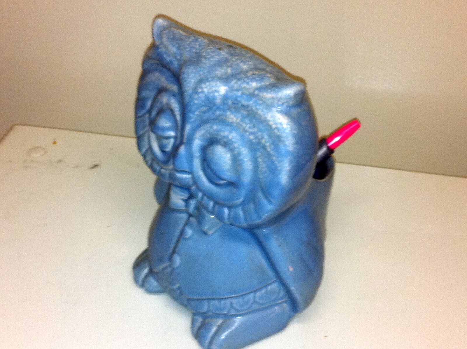 |
| Pencil/Pen Holder |
 |
| Pictures |
 |
| Bank |
 |
| Hand Towel Holder |
 |
| Vase |
 |
| Wall Hangings photos provided by myself |
Blog Post 002: Combine the DC Visual Sites


when visiting the natural history museum i loved the stuffed animals they had. while walking through the exhibits i found one of my favorites, a raccoon. they are so adorable to me and i have always had the largest soft spot for them... i actually hate the fact that i am pretty sure this little fella was alive, died, and is now stuffed... but at least he is living on as a teaching and learning tool.
when i visited the national art and portrait gallery i found the opening lobby space to be very dull, it was small, dull colored, and really had no spirit what so ever... I had almost passed this building off as a design disaster, until I found the middle courtyard area. the ceiling, designed by norman foster was one of the most amazing things i have ever, it looked so fluid, and made this a usable space all year long now. i can see why it was controversial, it is very modern, and this is very obviously an old building.


Tuesday, September 20, 2011
VC: Reception Desk Ideas

I feel this desk could work very well in my reception space. It has a very simplistic design and that is how I personally see the design of daisies naturally. I also think that just as the desk lights up and illuminates, light is one of the whole reasons daisies exist. I feel that these two items have a lot more in connection with one another then what would first meet the eye. Something about the colors of the desk even remind me of summer and green fields of daisies growing.
Saturday, September 17, 2011
VC: Sketch Up Color studies... Not Quite There
 |
| Monochromatic Colors |
 |
| Warm Colors |
 |
| Cool Colors |
 |
| Complimentary Colors |
Friday, September 16, 2011

Thursday, September 15, 2011
Blog 001: Seeing for the Blind
i have never thought about how a blind person lives, i have just thought how i never wanted to be that way; a horrible thought i know, but in all honesty... i am being truthful.
when i first entered in the waiting room/lobby space i saw it as bland and drab. i felt the space had no spirit, and even though i know all people who enter there are not blind, i felt it said they cannot see, so why focus on visual aesthetics? the only space i felt that had any spirit to it, was the small, and rather tacky indoor garden.
After going up and passing through a yet dull office space we entered the large warehouse. this space was your typical dim light with ultra violet lights, concrete floor, and bland concrete walls.
my favorite area was the working area. it was so busy and so alive. i have never seen so much action going on in one place. it felt like being in the very center of a beehive. everyone working, moving at a quick speed, almost like robots. it did feel like you stereotypical sweatshop, not in work or ethics of the place, but just the style of the room design. dim lights, closed off to the world, no idea of the world outside. i believe opening that up would do amazing aesthetics not only to the interior space, but the city itself. it is a world worth viewing.
it was amazing to see an environment like that. true human production at it's best. while the building felt lacking in aesthetics appeal, it should not dull the ethics and spirit of the facility. what these people are doing both workers and management should be proud of themselves.
now i feel like the facility should reflect that spirit.
when i first entered in the waiting room/lobby space i saw it as bland and drab. i felt the space had no spirit, and even though i know all people who enter there are not blind, i felt it said they cannot see, so why focus on visual aesthetics? the only space i felt that had any spirit to it, was the small, and rather tacky indoor garden.
 |
| indoor garden |
 |
| Warehouse |
 |
| Factory |
 |
| Factory |
now i feel like the facility should reflect that spirit.
Subscribe to:
Posts (Atom)