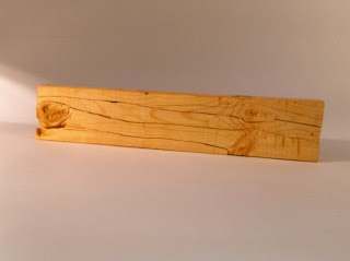
When sitting in on the 3rd year critiques it really gave me a chance to see what is to come. How my concepts are put into design learned from drafting class, to make a functional living space.
I was very intrigued by both projects that they had to do with both designing a space for a mental hospital as well as a restaurant/wine bar building that also housed living facilities.
One of the ideas that I really enjoyed for the hospital was the waves concept. I liked how she explained patient process as waves, and they go up and down. They can be soothing, or symbols of hardship, but overall the idea is to conquer them and regain control of one's life again.
The Buddhist Peacock idea was my favorite for 106 Parrish St. Wine Bar/Apartment concept. I liked how theirs felt so much more bright. I am not a fan over dark interiors, and that is what turned me off to most of the others. Theirs seemed so much more pleasant to me. I also loved the concept of the religious/mystical elements of the theme.
I can see with just the projects we have done in this semester we are moving in a design direction like this. I feel like this semester was just the baby steps of much larger design projects and conceptional ideas... I cannot wait to see what lies ahead. Semester one is at a close. Time to rest and reboot... and to also prepare for the next part of my journey to becoming a designer.
Tuesday, December 7, 2010
Looking Back Over the Semester
Drawing has been by far one of the hardest things I have ever had to learn. Something about my brain and hands do not always sync up and I get messy drawings and a lot of confusion.
I know that this is very important process to learn in the design field, and I have tons of worries about if I will ever be able to get it. I hope to press on and not lose any fighting strength.
I think one of my biggest regrets was not giving myself enough time to get all of my drawings done. I had some chances to have done better, and blew them by waiting until last minute to get them done. I have certainly learned how to better manage my time with homework.
I need to also learn to sketch more, because the more drawing I do, the better I can become. That is something I didn't do as much of as I wish. I wish I would have sketched a lot more.
I have enjoyed this class, even though I felt it kicked my ass all semester. I looked back over all of my drawings and I felt one of my best was the sections for the cube with the shape cut-outs. I worked for hours with Stephine to get them just right. With her help, she helped me create these
Late Posting of Scale Figures
Scale Figures Part One
Scale Figure Part Two
I liked the scale figures section. I have felt that so many of our projects in drafting are so cut and dry. I feel like with this section you get to add a little bit more of a personal touch. I liked drawing faces and clothes on them as well. It helped feed my love with the idea of fashion design. It has been a breath of fresh are to take a less "serious" drawing concepts after so much cube prospectives and sectional cut outs.
from start to finish... morning light through trees, the photo version.
this was the beginning visual idea for the lighting piece.
this was the 3-D model to accompany the visual idea. it was an abstract idea of light coming through trees.
these ideas led to the wood project previously featured on my blog.
the splinter idea carried on into the lighting piece. the following are the finished photos of light through trees.
this was the 3-D model to accompany the visual idea. it was an abstract idea of light coming through trees.
these ideas led to the wood project previously featured on my blog.
the splinter idea carried on into the lighting piece. the following are the finished photos of light through trees.
Subscribe to:
Comments (Atom)


