WAM Budget/Material Options
Wood Options
Looking at wood we have determined these possible options.
Birch plywood 4’x8’ ¾’’ not seeing wood of any kind at 1’’ thick
We are going to need at least 5 panels for this project.
At 54.00 dollars we would need 270.00 just for wood.
Baltic birch is also an option. It is marine grade and is more commonly used for boats. It has a slicker smoother finish
More commonly found in 5’x5’ options. 4’x8’ are possible though.
It would be 79.00 for sheets at ¾’’ and would cost somewhere in the ballpark of 395.00 dollars.
Birch Veneer is also possible. I believe this will take a lot of work to make a usable exterior for the chest. It is available in many sizes.
13x16’’x25’ 8.00
13x16’’x50’ 13.50
13/16’’x x250’ 36.00
2’’x25’ 19.00
2’’x50’ 32.50
Prefinished birch is also an option. This is actually what they would use to make cabinets in houses.
4’x8’ at ¾’’ would be 285 dollars
If price needed to be lower, stains and finishes could be added to many of these lower grades of wood to make them smoother, slicker, and more cosmetically pleasing. This would lower costs, but would add to labor and time of final production.
Interior Shelf Ideas
We are currently pursuing options in the shelving ideas
Plexiglass is a cheap and very possible to use. Either sprays, or steel wool can frost Plexiglass, but it has the tendency to hold and show dirt and oil from human contact, not a very appealing look on a display rack
Fiberglass is an option. Thick enough with help from added supports that could be added would make them durable enough
They could be made to fit pretty easily and cheaply enough by just adding a peg support column to the inside sides of the chest. It would also make it very easy to change the width between the shelves to included wider selves if needed.
Glass is also a possibility, but this would not be the cheapest or possibly the safest material to use.
Wood shelves covered in some type of metal paneling are also a possibility. It would add to cost because more wood would have to be bought, but with the addition of metal it would create more of a possible interior reflection to take place with the right type of metal.
Exterior Options and Ideas
We have looked into adding nickel knobs, handles, handle bars to the exterior. These are hard to pinpoint an exact amount on. They range from all styles and price spectrums. It can easily be said, lower the price, lower the quality of the piece.
Shelves similar to the ones on the interior could be added to the sides, to expand display space. That would be along the same price Hinges will also have to be bought for the doors on the front face of the piece.
Adding a lighted interior could make display more noticeable, but would limit mobility of overall piece unless battery operated.
Changing the shape and size of the doors could change the ways and spaces for display space.
My rough estimations at this stage in the game would be anywhere from 600-700 dollars.
Budget After Detailed Pricing
Wood- We need 5 sheets of the following (prices of overall total)
Birch plywood- 270.00
Baltic Birch- 395.00
Prefinished Birch- 285.00
Birch Veneer – an option but the sizes are different and we would need different amounts which could affect the overall price for less or more, may not fit needs overall.
Interior- Shelving for gift shop items to be displayed
.220 24x48 Acrylic sheets- 53.99
Battery LED Lights (Pack of 2)- 32.07
Peg rack railing and pegs- 3.00-5.00
Hinges for the doors- 3.00-5.00
Corkboard (3/16 inch 4ft x8ft)- 17.48
Corkboard hanging shelves- 6.48 a piece
Bottom Drawer/Exterior of Display Doors- Extra storage for items displayed
Knobs- 3.00-5.00 (Can even be more expensive depending on exact quality and taste)
Drawer Track- 11.00-15.00
Additional Items
10x10 Aluminum Metal sheets- to add metallic element possible desired-10.98
Satin Finish- Will give very neutral finish- 36.98
Semi-Gloss Finish- Give more reflective quality to wood- 37.98
Pull Plate- Strong Handle for cabinet- 20.00
Screws- Possibly already in wood shop- no cost
Sandpaper- Possibly in wood shop- no cost
PMS 380 green paint- Possibly already at WAM- No cost
Wheels- for moving cabinet- 6-13 (a piece)
Electrical System- Wood require wall plug- Prices may vary
Paints- For whatever purposes desired- Prices may vary
Wood trim- Add to exterior- 98 cents and up
Screw peg covers- birch color, covers screws- 5.00
Next Stages
Decide on a more finalized idea
Account in new budget changes to overall final budget
Meet with WAM and decide their opinions on our finalized idea
Begin buying supplies, and starting construction on the piece

Thursday, September 29, 2011
WAM Budget Work This Week

As our group works ahead on creating our gift shop cabinet piece we have been dealing with a lot of ideas and issues. I have been working on pricing a budget.
Monday I drove out to a wood store in Gibsonville to price wood prices and get an idea of what kind of wood style we should use. Kate at the WAM gift shop said birch wood, so I looked at the various types and what prices I could get them at.
We are looking a birch ply, birch veneer, and a Baltic birch. All different types have various uses, looks, and different needs to help it reach it's final look.
Wednesday Matt and I went to look for acrylic sheets that we could use for our shelving inside of the cabinet. We had not so great luck with this venture.
Thursday night I went to Lowes hardware and looked at prices at all things needed to go along with this. I found wheels for the base, metal sheeting for a possible material, handles, knobs, hinges, LED lighting, etc.
What I am quickly realizing is how many items are needed to complete this project. It also makes it hard in the beginning because there are so many options and so many different items needed to make all those various ideas happen.
Tomorrow is first pinup... I look forward with presenting my findings and prices of the various items I have looked and, and had to learn about.
photo provided through uncg.edu
Blog Post 003: Speaking of Speeches
 |
| Never know when you'll have to give one. |
When first presented with this speech assignment, I wasn't nervous or worried at all. I don't clam to be an expert at speeches, but I am not shy, and I don't mind talking to people or in front of them.
When writing it I just wanted to keep it very simple. That is why I chose to focus on just one site. The less you remember to talk about, the more you can focus on the details of the speech, and remember easier about what you planned to talk about.
I found our visit from the speaking center very helpful and it gave me a better direction to follow. I did feel that I lacked the convincing aspect that they mentioned, but I felt that I more wanted to describe how I felt in the space, and not really sway an opinion in any sort of direction. Do I think a visit to the center would have helped my speech??? Of course I do.
Next time I plan to slow up my pace. I feel like I talked way to fast. I also brought a pen up with me that I fidgeted with, I won't do that again... I move my hands enough when I talk as it is. I want to have a much more detailed visual aid next time around. I feel mine was limited on major detail and was a little all over the place.
I enjoyed this project and I see the importance of learning to give proper speeches. In our future field of design, we will constantly give speeches on project ideas, work with teams, and be able to really describe and convince clients of various degrees of ideas, concepts, and recommendations. The better I become at this, the more I will be prepared in the future as a designer.
photo provided by google
Thursday, September 22, 2011
Torii
Torii is a Shinto design item that stands in front of temples. It is a symbol one is entering a scared space and no longer in the common world. They were orignally made from wood and stone. Today they are more commonly made of concrete. The oldest one dates back to the 12th century. This one is from the Itsukushima Shrine in the city of Hatsukaichi, located in the Hiroshima Prefecture in Japan.
I love how the design of this object resembles the background and the water that it sits in. It is very natural in shape i think, and that is very fighting that it is a symbol in the Shinto religion since it is so tied to nature.
It serves as a symbolic gateway into the Shinto ideals. It plays off the elements are representing nature and natural form.
photo provide by wikipedia
Owls in Interiors
I have a huge obsession with collecting owl interior things. Pictures, figurines, wall hangings, big owls, small owls. I loved when we were in dc and i found this in a mural on the mosaic tile on the wall.
 I started thinking about all the different decor items that feature/are owls, and looking at my collection i found many different uses and styles... the home decor owl is like a multi-use object in an interior space. Mark my words... it's the new black.

 |
| Figurine |
 |
| Salt/Pepper Shaker |
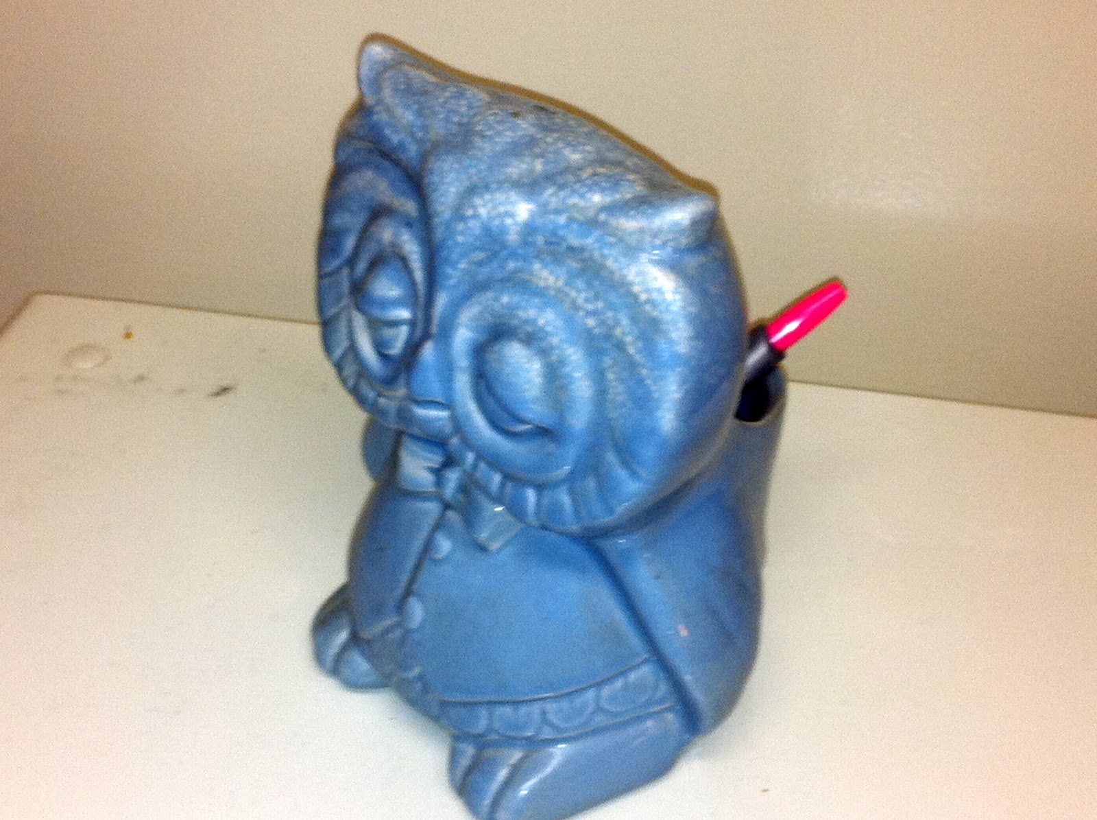 |
| Pencil/Pen Holder |
 |
| Pictures |
 |
| Bank |
 |
| Hand Towel Holder |
 |
| Vase |
 |
| Wall Hangings photos provided by myself |
Blog Post 002: Combine the DC Visual Sites


when visiting the natural history museum i loved the stuffed animals they had. while walking through the exhibits i found one of my favorites, a raccoon. they are so adorable to me and i have always had the largest soft spot for them... i actually hate the fact that i am pretty sure this little fella was alive, died, and is now stuffed... but at least he is living on as a teaching and learning tool.
when i visited the national art and portrait gallery i found the opening lobby space to be very dull, it was small, dull colored, and really had no spirit what so ever... I had almost passed this building off as a design disaster, until I found the middle courtyard area. the ceiling, designed by norman foster was one of the most amazing things i have ever, it looked so fluid, and made this a usable space all year long now. i can see why it was controversial, it is very modern, and this is very obviously an old building.


Tuesday, September 20, 2011
VC: Reception Desk Ideas

I feel this desk could work very well in my reception space. It has a very simplistic design and that is how I personally see the design of daisies naturally. I also think that just as the desk lights up and illuminates, light is one of the whole reasons daisies exist. I feel that these two items have a lot more in connection with one another then what would first meet the eye. Something about the colors of the desk even remind me of summer and green fields of daisies growing.
Saturday, September 17, 2011
VC: Sketch Up Color studies... Not Quite There
 |
| Monochromatic Colors |
 |
| Warm Colors |
 |
| Cool Colors |
 |
| Complimentary Colors |
Friday, September 16, 2011

Thursday, September 15, 2011
Blog 001: Seeing for the Blind
i have never thought about how a blind person lives, i have just thought how i never wanted to be that way; a horrible thought i know, but in all honesty... i am being truthful.
when i first entered in the waiting room/lobby space i saw it as bland and drab. i felt the space had no spirit, and even though i know all people who enter there are not blind, i felt it said they cannot see, so why focus on visual aesthetics? the only space i felt that had any spirit to it, was the small, and rather tacky indoor garden.
After going up and passing through a yet dull office space we entered the large warehouse. this space was your typical dim light with ultra violet lights, concrete floor, and bland concrete walls.
my favorite area was the working area. it was so busy and so alive. i have never seen so much action going on in one place. it felt like being in the very center of a beehive. everyone working, moving at a quick speed, almost like robots. it did feel like you stereotypical sweatshop, not in work or ethics of the place, but just the style of the room design. dim lights, closed off to the world, no idea of the world outside. i believe opening that up would do amazing aesthetics not only to the interior space, but the city itself. it is a world worth viewing.
it was amazing to see an environment like that. true human production at it's best. while the building felt lacking in aesthetics appeal, it should not dull the ethics and spirit of the facility. what these people are doing both workers and management should be proud of themselves.
now i feel like the facility should reflect that spirit.
when i first entered in the waiting room/lobby space i saw it as bland and drab. i felt the space had no spirit, and even though i know all people who enter there are not blind, i felt it said they cannot see, so why focus on visual aesthetics? the only space i felt that had any spirit to it, was the small, and rather tacky indoor garden.
 |
| indoor garden |
 |
| Warehouse |
 |
| Factory |
 |
| Factory |
now i feel like the facility should reflect that spirit.

Friday, September 9, 2011
GHM Exhibits
Entering the exhibits of the museum gave me a new light and feeling for the space and what it needs to provide in the lobby space. This truly is an amazing space after one gets an entire feeling for the space.
When I first came in I entered the Jewish heritage of the south exhibit. I found this to be very interesting. I never knew so much Jewish connects were throughout the state. I also really enjoyed the fact many things were interactive, and you could touch and open, and try on. This was a very exciting museum experience. I have never been in a setting like that where one was allowed to have so much freedom in their learning experience in the museum. This is something the lobby lacks. This is a very interesting aspect to the space as a whole. Maybe a small example of how their museum works ahead. Something people could get a feel of the freedom liberties within the museum.
Moving beyond this space I visited the Civil War guns and knives room. I see the cultural connect to the history of the south here, but I found it to be my least favorite and rather boring. It felt much more cold and disciplined room on the trip. I did however like the paintings on the wall in this room. I felt they not only added a aesthetic to the room, but linked art and history conflicts together that is always an interesting aspect in learning about history I think.
Moving deeper into the weaving path of this museum I enter the historical exhibit of Greensboro. I found this space to be very exciting. It creates it’s own time capsule. Where I did find it campy and a little excessive at moments, it did feel very welcoming and created an image I don’t think harms the idea of Greensboro. It also was very hands on and made this feel more unique then most people would be to museum learning.
Down another spiral staircase we are met with what was once the old church. I find the preservation of the stained glass window to be very fitting with the history and tradition of the space, and I found this entrance oddly enough more inviting and unique then the one they presently use as their lobby space. This is also the start place to enter the Voices of Greensboro exhibit.
This is the largest and lengthiest of all the exhibits, as it should be since I think this part sums up the entire idea of this museum space as a whole. It creates a time line from Native American start to what Greensboro is like today; different generations of all races and finical statuses, from sports to entertainment, to Greensboro’s contributions to the globe. They had it all. Where it was a very interesting site to see, it lacked in the unique hands on approach that much of the other museum used. It made it feel very standard to all other museum spaces that I have been to in my life, and honestly made me not enjoy this main attraction of the space as much as I feel I possibly could have.
After winding and weaving through the maze of the Voices exhibit we are brought into the gift shop. I find the placement of this space rather odd. It feels like I should have already passed by it, or I haven’t quite reached it yet. The space was very relaxing when I comes to museum shopping, but I felt it lacked in personality to the space overall. It felt many of the items were nothing more then what one could find at their local Target or Pier 1 imports. There was a small collection of original pottery from the local Sea Grove pottery area, and that was very nice to see. It also tied in very well with the local pottery collection exhibit that lie just ahead of the shop.
One of the strangest things I found was the cemetery off of the gift shop. Since this use to be an old church there was a very historic graveyard outside. It was one of my favorite parts of the museum experience. It was a true chance to walk more amongst the long history of the city. It was also a very added experience of offering an outdoor learning opportunity. The part I found so odd, is how it came off of the gift shop, and how without real close examination of the door leading out, one would not think this was a part of the museum trip. I even had to ask if I was even allowed to go out there.

Finally we come to the small Dolly Madison exhibit before we come out on the mezzanine leading back down to the lobby. Leaving with much more ideas for the lobby space and how to connect it better with the rest of the space.
My overall main thoughts are that people need more of a hands on experience to showcase many of the exhibits that are ahead, and the lobby overall should reflect a design theme of some period, possibly very similar to the Cone interiors. This could create a more historic connection over all in that lobby space.
Seeing the museum overall did give me many more ideas on what could be done with the space, and I think of my trip as just another tool in adding inspiration to me ideas for designing the space.
Seeing the museum overall did give me many more ideas on what could be done with the space, and I think of my trip as just another tool in adding inspiration to me ideas for designing the space.

Wednesday, September 7, 2011
My Place
After visiting the three sites. I have decided that personally I would like to work at the WAM or IOB. These two spaces were my favorite ones.
WAM I would like to get more hands on building training, that is something I have never really done before. I also would really like to work on conceptional ideas on where to put the chest and what ideas it could be used for. I haven't heard a true idea on what to use, and I would like to be involved with that project as well.
At IOB I greatly enjoyed the idea behind the factory, their history, and the possible concepts for designing that space. I felt the possibilities were endless there. I still struggle greatly witch sketches and drawings, but I would love to come up with ideas for them. Concept work would be amazing at this project. I would love to think up ways to relate the design ideas to the ideas the company holds in their long history of operation.
GHM was not so much a favorite place to visit. Where I like the shape and design of the building, and coming up with possibilites of what could be sound amazing, it just didn't make my top interest. However given the chance to work there as well would be an amazing chance no matter what.
I believe my strengths lie within being able to come up with creative ideas to help building the project. I think I am a very creative mind, and I find working with materials, and looking at colors, and possible design ideas, give me the most inspiration and help me work at my best.
IOB Narrative and Diagram
The Industries for the Blind, INC. has a 78-year history in Greensboro. When the company first began it gave jobs to the blind to have them feel as though they had a civil service duty in society. They made mops and brooms. It was a non-profit organization.
Today they make profits, pay wages for the seeing impaired employees, have huge accounts with the United States military, and employee over 215 people. They employee people from all walks of life, and even from other nations; most with sight disabilities.
With such a long lasting relationship with North Carolina and Greensboro, it is amazing we know very little about them like we do… Well, they wish to change that.
The idea for the space is to open it up to the world, both physically and metaphorically. The space lack very few windows, a sign of former management that didn’t quite see the employees as the people they deserved to be seen as. They felt too much exposure to the world, would limit their ability to work more productively.
When entering the space we are met with the bright morning sun shinning over the building and the parking lot that we stand in. It gives the building a bright feeling, but all of this is quickly lost.
When we enter we have a small lobby, very vacant of color, and even personality. The front desk is behind a glass window, and the door that leads beyond is locked.
After being buzzed through we come to a small stairwell. Elevators are also located here. In a corner we see an indoor garden. It feels very tacky and lacking in much taste to be as honest as I can be. It is a nice touch though. It is the first real moment of the space as a whole, a true moment of “Zen” if you will. This becomes more justified the deeper I go on the journey.
Up the stairs is where offices and conference room is located. This space has much more natural light coming in from windows, but still is outdone by the ultra-violet ceiling lights.
Through the offices we enter the factory. We see storage rooms, vast rooms with crates and shipment ready to send out, work areas alive with machines and workers. This area resembles more of a beehive of activity. Everything feels alive. Through this Journey we circle back around and come out at the indoor garden once again.
And as promised… Zen.
Zen gardens are to allow for tranquility to find meditation possible. I feel the factory, as a whole, is in somewhat meditation.
The workers, many of who are seen to be disabled too much of society are allowed to work and be fully functioning members of the world. They go to work everyday, make wages, and learn skills. They are proving lack of sight does not have to be a set back in being a person in society.
Just as mediation is to teach one the way of the world, the meaning to life, so does this company. It gives these workers a chance at their own life. That is why I feel that indoor garden is such a useful tool for this space.
This space should be more open. Allow the world to see into the space. It is an amazing space with great potential to not only these people’s lives that work within, but also the meaning of their work to the world.
GHM Narrative and Diagram
A spiral in from the world, we find North Carolina, then even smaller into Greensboro, deeper that we go we find downtown, and centered within that our spiral brings us to the Greensboro historic museum.
Curves and spirals is the first taste I get of the space walking up to it. The building has a dome like shape and all the windows are curved and arched with circular shapes within them.
Upon entering the lobby we are met with a curved with light shinning in from the huge curved windows I mentioned on the walk in. I large curved wall, with a spiral staircase leading up stairs to the exhibits.
The room lacks warm colors and is mostly dark green walls and tan title floors with a little mix of dark red diamonds within them. The only bright colors we see are the banners of history on the walls, and these feel mute in the large space.
To the left we find a small exhibit showcasing one of the larger exhibits upstairs, but it feels very cramped in the space. There is also an auditorium off to this side in the back of the space, but the path of travel there is not quickly noticed.
On our right we find a small and somewhat out of place welcoming desk, the large spiral staircase that leads up to both a dimly light 2nd floor mezzanine floor and on to the third floor exhibit rooms.
Straight ahead is a small cove, the offices of the museum to the left, restrooms to the right.
The space is large and has many possibilities, but it seems lacking in the purpose and use of the facility, to showcase the history of Greensboro. It could also benefit from the large windows providing natural light. The interior lights are odd shaped and lack to add any purpose to the space. The colors in the space could become warmer to enhance the area and make it more inviting.
More of my process on the space to follow… To be continued.


Subscribe to:
Posts (Atom)