When sitting in on the 3rd year critiques it really gave me a chance to see what is to come. How my concepts are put into design learned from drafting class, to make a functional living space.
I was very intrigued by both projects that they had to do with both designing a space for a mental hospital as well as a restaurant/wine bar building that also housed living facilities.
One of the ideas that I really enjoyed for the hospital was the waves concept. I liked how she explained patient process as waves, and they go up and down. They can be soothing, or symbols of hardship, but overall the idea is to conquer them and regain control of one's life again.
The Buddhist Peacock idea was my favorite for 106 Parrish St. Wine Bar/Apartment concept. I liked how theirs felt so much more bright. I am not a fan over dark interiors, and that is what turned me off to most of the others. Theirs seemed so much more pleasant to me. I also loved the concept of the religious/mystical elements of the theme.
I can see with just the projects we have done in this semester we are moving in a design direction like this. I feel like this semester was just the baby steps of much larger design projects and conceptional ideas... I cannot wait to see what lies ahead. Semester one is at a close. Time to rest and reboot... and to also prepare for the next part of my journey to becoming a designer.

Tuesday, December 7, 2010

Looking Back Over the Semester
Drawing has been by far one of the hardest things I have ever had to learn. Something about my brain and hands do not always sync up and I get messy drawings and a lot of confusion.
I know that this is very important process to learn in the design field, and I have tons of worries about if I will ever be able to get it. I hope to press on and not lose any fighting strength.
I think one of my biggest regrets was not giving myself enough time to get all of my drawings done. I had some chances to have done better, and blew them by waiting until last minute to get them done. I have certainly learned how to better manage my time with homework.
I need to also learn to sketch more, because the more drawing I do, the better I can become. That is something I didn't do as much of as I wish. I wish I would have sketched a lot more.
I have enjoyed this class, even though I felt it kicked my ass all semester. I looked back over all of my drawings and I felt one of my best was the sections for the cube with the shape cut-outs. I worked for hours with Stephine to get them just right. With her help, she helped me create these

I know that this is very important process to learn in the design field, and I have tons of worries about if I will ever be able to get it. I hope to press on and not lose any fighting strength.
I think one of my biggest regrets was not giving myself enough time to get all of my drawings done. I had some chances to have done better, and blew them by waiting until last minute to get them done. I have certainly learned how to better manage my time with homework.
I need to also learn to sketch more, because the more drawing I do, the better I can become. That is something I didn't do as much of as I wish. I wish I would have sketched a lot more.
I have enjoyed this class, even though I felt it kicked my ass all semester. I looked back over all of my drawings and I felt one of my best was the sections for the cube with the shape cut-outs. I worked for hours with Stephine to get them just right. With her help, she helped me create these

Late Posting of Scale Figures

Scale Figures Part One

Scale Figure Part Two
I liked the scale figures section. I have felt that so many of our projects in drafting are so cut and dry. I feel like with this section you get to add a little bit more of a personal touch. I liked drawing faces and clothes on them as well. It helped feed my love with the idea of fashion design. It has been a breath of fresh are to take a less "serious" drawing concepts after so much cube prospectives and sectional cut outs.
from start to finish... morning light through trees, the photo version.
this was the beginning visual idea for the lighting piece.

this was the 3-D model to accompany the visual idea. it was an abstract idea of light coming through trees.

these ideas led to the wood project previously featured on my blog.
the splinter idea carried on into the lighting piece. the following are the finished photos of light through trees.


this was the 3-D model to accompany the visual idea. it was an abstract idea of light coming through trees.

these ideas led to the wood project previously featured on my blog.
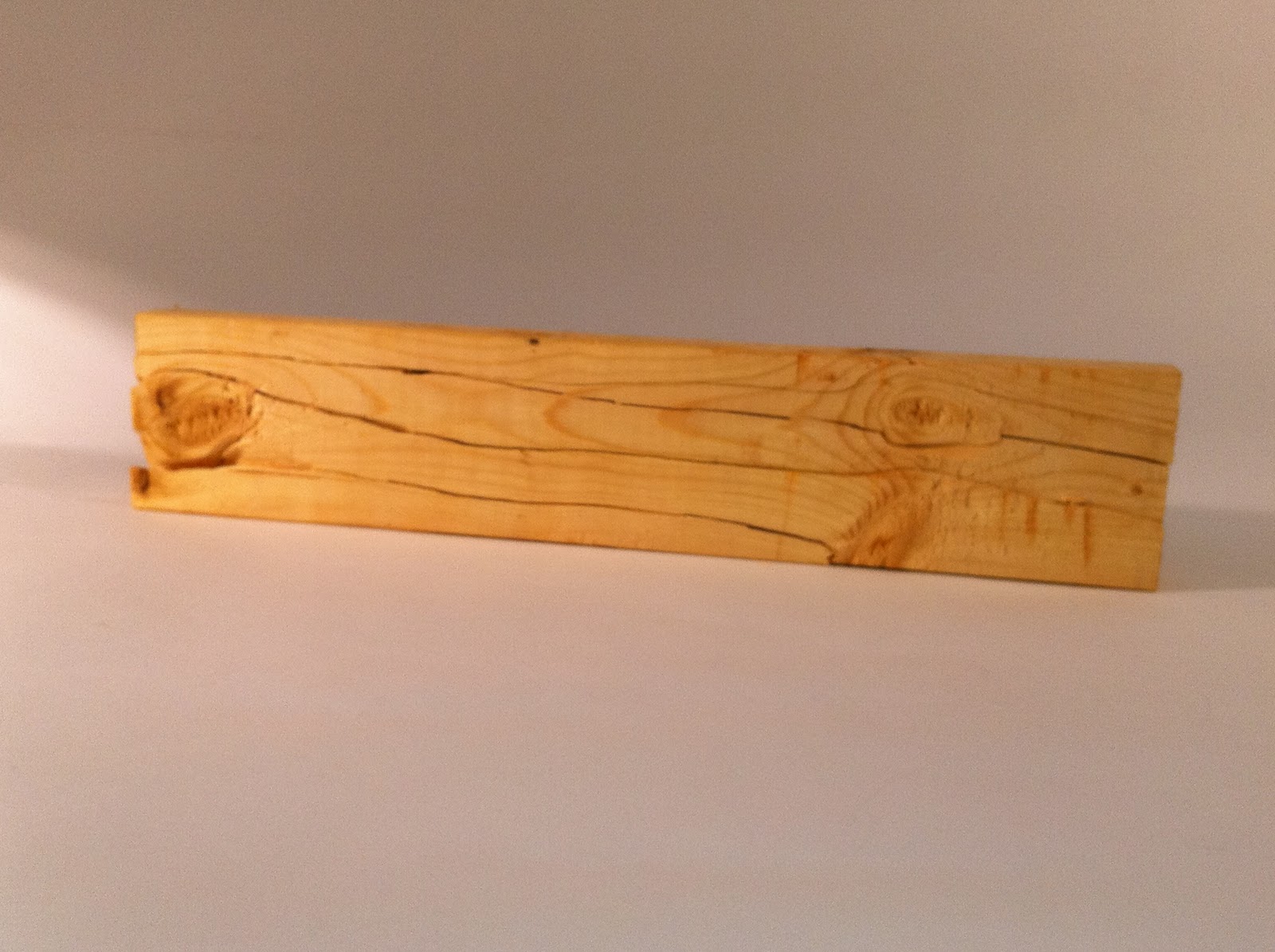
the splinter idea carried on into the lighting piece. the following are the finished photos of light through trees.


Tuesday, November 30, 2010
morning light through trees.
This has been a long and painfully stressful process. I have felt several ups, and lots of downs to get to this point, and I like where it brought me in the end. I just hope my crazy mind translates to everyone else who views the piece.
My inspiration for my piece came from a slide that Leah presented to the class. It is a lighting installment from designer Tord Boontje. The following pieces are in Boontje's collection and were taken from the website.


inside on single beam of fluorescent light peaking out. just like the light beam the morning oh so many months back.
My inspiration for my piece came from a slide that Leah presented to the class. It is a lighting installment from designer Tord Boontje. The following pieces are in Boontje's collection and were taken from the website.


I love the feel of these. they seem so precious and whimsical. It reminds me of flowers and ivy from like a fairy dream world.
I was also reading about the Dada Art movement of the early 20th century. How the events of World War I created this idea to abandon all that is considered to be art or creative works, because all that it brought us was death and destruction.
This idea brought me to think about chandeliers in general. They are usually symbols of interior prestige. Most of the time a central focal point in a room. They are most often covered with gold and silver, and drenched with crystals. An overkill item when it comes to wealth and luxury. Then I thought what would be the opposite of that?
I began to collect wood from scrap piles all around. I used nails to bound it together that had been previously used on the pieces of wood. I thought about draping it with cloth, but since this was garbage pieces, why not use garbage bags.
I tried to work the pieces together in a way that it even looked like trees, and vines, and nature. Very uneven, fragile in its shape and frame.
inside on single beam of fluorescent light peaking out. just like the light beam the morning oh so many months back.
I thought it important to work on the piece outdoors looking at the way trees would sway in the wind, and how the movement of the leaves would change the way the light came through. It caused me to miss many days in studio time, but I felt it was needed to better understand the concept of the piece.
The garbage bags were so light that the air can easily move them, causing just the slightest wind to rustle them and make it change the way the light comes through.
I felt the piece needed to be all black to better represent the original event that inspired me on that grey morning. The way the photo came out, everything in the world captured looking monochromatic.
When I step back from the piece it looks eerie and some what ghoulish. It feels much more like an art piece than a lighting piece to me. It holds some life that even myself haven't quite come to fully understand yet. I am just anxious to finally see it lite up and hanging. Photos of the final piece will be up very soon.
Monday, November 8, 2010
Hailey Taylor and Courtney Wilson Drawings
When I looked at these girls sketch books the first thing i thought, they are better than mine. I know I have my own style but I found things in both of their drawings that I would love to learn more.
Hailey is up first. I love these flowers. They are not the most detailed, but the soft shades and the delicate curves of the petals make this such a pretty sketch. It also has a hint of playfulness, which makes me enjoy it even more.

Now for Courtney. I love her self portrait drawing. It is very playful, but has so much detail too. It reminds me of a picture in a graphic novel of some sort. I love the expression. It has a lot of attitude. I feel she has the right mix. The teeth look so cool to me too, great detail.

Hailey is up first. I love these flowers. They are not the most detailed, but the soft shades and the delicate curves of the petals make this such a pretty sketch. It also has a hint of playfulness, which makes me enjoy it even more.

Now for Courtney. I love her self portrait drawing. It is very playful, but has so much detail too. It reminds me of a picture in a graphic novel of some sort. I love the expression. It has a lot of attitude. I feel she has the right mix. The teeth look so cool to me too, great detail.

Studio Sketches
drawing is not one of my favorite things to do. i see it's important in design and i should use it more, it just hasn't come very naturally to me. so i am still shying away from it. i have very rough skills and my drawings look much more harsh then most of my fellow students. i don't focus on detail enough. i flipped through my book and tried to find the three i felt came through better then some of the other drawings i have done.
the following two drawings came from a day i spent looking at light high the water and plants around a pond.


the next drawing was done in the studio one day just looking at light on a water bottle. i feel i still struggle to capture realistic drawings.

the following two drawings came from a day i spent looking at light high the water and plants around a pond.


the next drawing was done in the studio one day just looking at light on a water bottle. i feel i still struggle to capture realistic drawings.

Subscribe to:
Posts (Atom)